How to Build a PowerPoint Organizational Chart With Excel Data

Building an organizational chart in Excel makes sense because it’s easy to pull data from sources like other Excel documents or Outlook. When it comes time to show off that chart, you’ll probably want to use PowerPoint, though. Fortunately, bringing the Excel chart over to PowerPoint is fairly simple.
Creating the Organizational Chart in Excel
First, open a new Excel sheet. Head over to the “Insert” tab and select the “SmartArt” option.

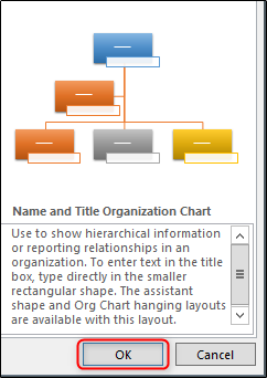
The “Choose a SmartArt Graphic” window will appear. In the pane on the left-hand side, select “Hierarchy.” You’ll see several different chart styles appear on the right. Choose the one that suits your needs best. In this example, we’ll choose the “Name and Title Organizational Chart” option.

After you select your chart style, a preview of the chart and the chart’s description will appear on the right-hand side of the window. Select “OK” when you’re ready.

Your chart will now appear in the Excel sheet. Fill out the relevant information for your team members in the chart (or pull the data from other sources). Once you’re finished, you should have something that looks like this.
Read the remaining 19 paragraphs
via: howtogeek.com

Post a Comment